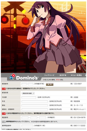
There are many reasons to like a given anime series, including a truly fresh story approach, characters with endearing moe features, wanting to study the technical aspects of creating high-quality animation, or, well, fanservice and pantsu. I often find myself drawn to shows with a high level of design, in which creators have taken the extra time to create a unique and visually stunning world to place their characters in. There are quite a few outstanding series with excellent design, from Lain to Jigoku Shojo to Spice and Wolf to Sayonara, Zetsubou Sensei and the new Sasami-san@Ganbaranai. One of my eternal favorites is the Bakemonogatari series, in which every frame of animation and every line spoken by the talented voice actors is designed to draw viewers into a unique world. Sadly this dedication to excellent design doesn’t extend to the web, and one of the things I dislike the most is using web forms on Japanese websites, which generally come from a very dark part of design hell. There’s something about Japan that makes them especially bad at creating online forms that are easy to use, and every time I need to enter information into a form on a Japanese website I know it’ll be an exercise in frustration. Sometimes the problems are needlessly technical, like requiring that users type some information in 半角 hankaku or 1-byte Japanese characters, and other information in 全角 zenkaku, full sized 2-byte Japanese characters. (What’s really fun is that space characters also come in single and double widths, which look the same on the screen but are totally different as far as the form is concerned.) Other frustrations include forms that force you to enter your “kanji name” despite the fact that some users are foreigners without kanji, or forms that only work with the latest browser versions from 2004. When I made the post about the Hatsune Miku Domino’s Pizza app I decided to register with the company to make sure I could help any J-List customers who might need help using the app…but getting the form to actually create an account for me was a Sisyphean effort that consumed more than an hour.

Japanese love good design…except web forms.


